

Brand Development:
The Applewhite Agency
Brand Developer and Creative Director
Summary
The Applewhite Agency is a mission-driven marketing agency founded by Jordette Applewhite. I came on as creative director and brand manager before the brand existed, leading brand design, strategy, and creative direction to shape its identity from the ground up. Jordette had done this work for years, but launching her own agency was a new professional chapter, and she was repositioning to serve a different, mission-focused clientele than her previous brands had.

The Challenge
Standing out in a crowded field. Marketing agencies are everywhere, and the brand needed to feel distinct, not interchangeable.
Starting from zero. There was no existing identity to build on, and the new brand had to clearly separate her from her earlier work outside professional services.
Signaling a new direction. She was now pursuing mission-driven businesses, so the brand had to read as professional and credible while still feeling modern and human.
The Strategy & Approach
I started with positioning, not visuals. Before any design, I defined who Jordette was in the market: a strategic, trusted guide for mission-driven businesses, distinct from her earlier work outside professional services.
Archetype and positioning. I anchored the brand in the Sage, reflecting her wisdom, strategic leadership, and the trust she earns with clients. This set her apart in a crowded agency field by leading with credibility and guidance rather than noise.
Voice and tonal direction. Building on the Sage, I set the brand's tonal direction: purpose-led, credible, and human rather than corporate. The goal was for Applewhite to read as a trusted, values-driven guide, so everything that followed reflected wisdom and intention over hype.
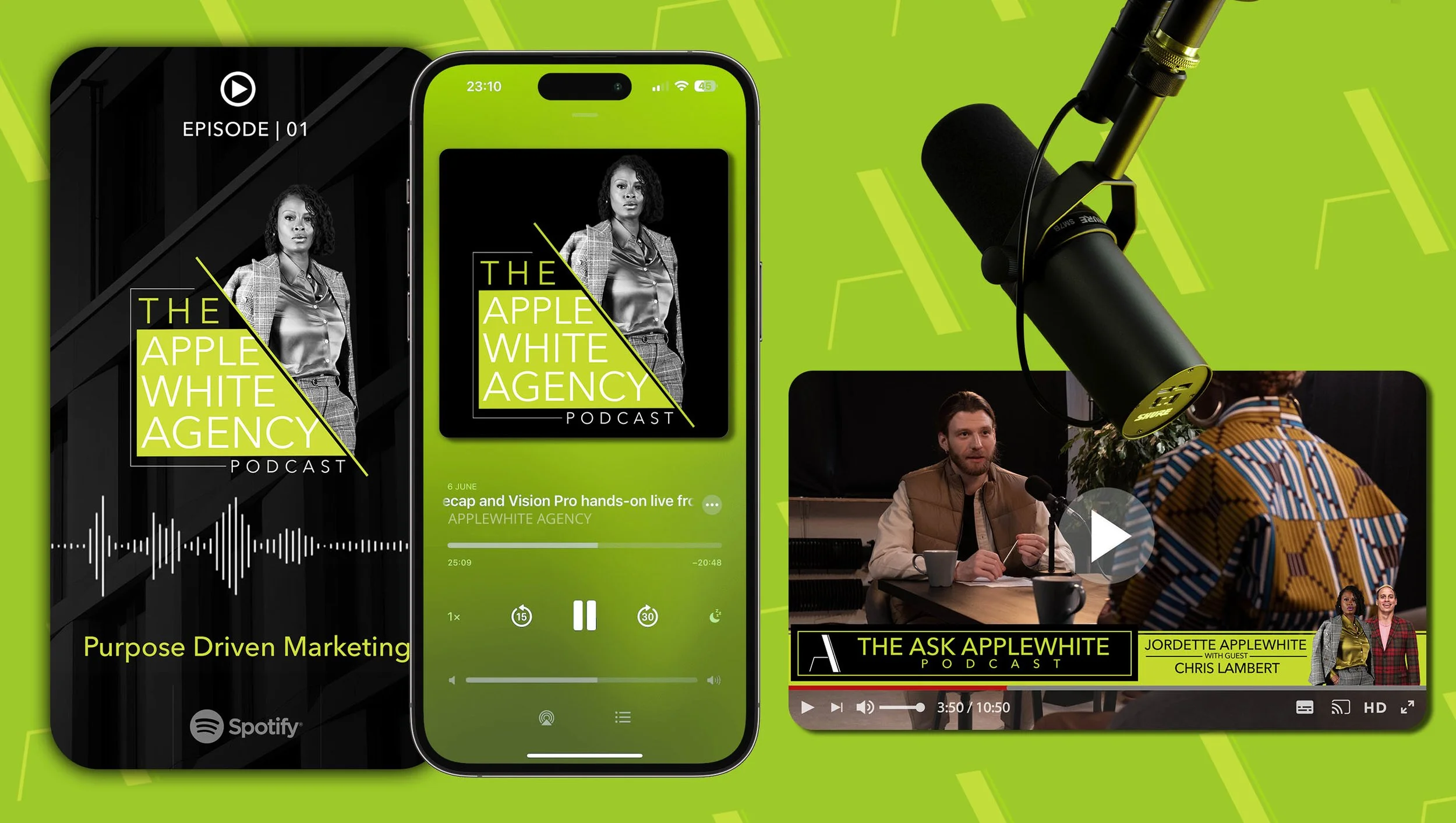
Audience and channel strategy. Researching comparable agencies, I found a consistent gap in how they connected with their audiences. Because her clients weren't primarily on social, I positioned social as reinforcement and focused communication where her audience actually was, a strategic choice, not a default.
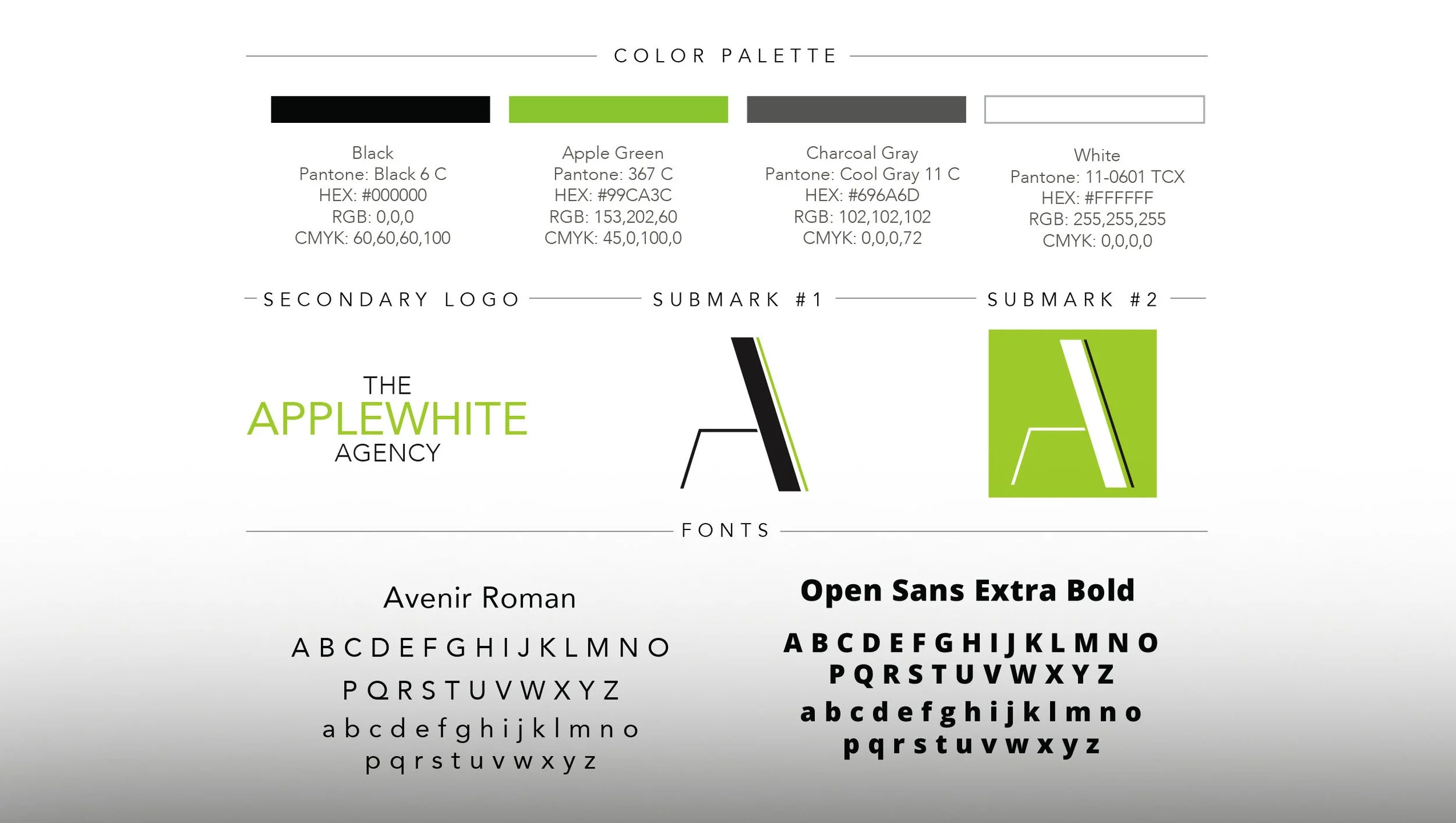
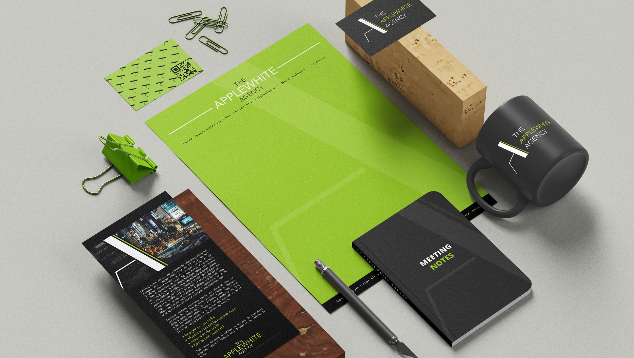
Visual identity as expression. Only then did the visual system follow. Green nodded to the "apple" while signaling growth and trust, and clean, high-contrast lines gave the brand a modern, confident edge, each choice laddering back to the Sage positioning.


The Impact
The new brand gave Jordette a polished, professional identity to launch her agency and confidently pursue mission-driven clients. Years later, it's still in active use, continuing to represent and grow the business, the truest test of a brand built to last.